
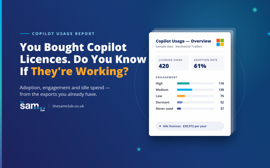
All figures, names, and screenshots in this article use fictional sample data for a fictional company (“Northwind Traders”) and do not represent any real organisation, employee, or client.
Most organisations that roll out Microsoft 365 Copilot can answer one question with confidence: how many licences did we buy? Far fewer can answer the questions that actually matter — who is genuinely using it, who tried it once and gave up, which departments need help, and how much of that licence spend is sitting idle right now.
The Microsoft 365 admin centre gives you the raw exports to answer those questions. What it doesn’t give you is a single place that turns those exports into decisions. That’s the gap this report closes: one Excel workbook, built from the CSV exports you already have access to, that turns scattered usage data into a clear picture of adoption, cost, and risk.
Here’s what it looks like in practice.
The one-page view leadership actually wants
The report opens on an Overview page: total licensed users, how many are genuinely active, an adoption rate, and a breakdown of engagement into High, Medium, Low and Not Using — all in one glance, backed by charts.
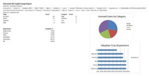
Overview page: headline adoption metrics, a category pie chart, and a department adoption bar chart.
This is the page built to be screenshotted straight into a leadership update. It answers “is this working?” without anyone having to open a spreadsheet and start filtering.
Beyond “logged in once”: a real engagement score
The number that gets quoted most often after a Copilot rollout — “80% adoption” — usually just means 80% of licensed users opened Copilot at least once. It says nothing about whether they kept using it.
This report scores every licensed user out of 10, based on how recently they used Copilot, how many prompts they’ve submitted, how many days they’ve actually been active, and how many different apps they use it in. That score sorts people into High, Medium, Low, Dormant and Never Used — and pairs every single one with a recommended action, so the report tells you what to do next, not just what happened.
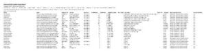
Employee Detail: every licensed user with usage frequency, score, category, and a recommended action.
A “champion” gets flagged for a case study. Someone stuck on Low gets flagged for training. Someone who’s gone quiet after a strong start gets flagged for re-engagement before the recommendation to reclaim the licence.
Department-level accountability
Rolling all of this up by department turns individual engagement scores into a management conversation. Which teams have genuinely embedded Copilot into how they work, and which ones have licences that are mostly going unused?

Department Analysis: adoption rate, habit rate, average score and prompt volume by department.
This is the page that turns “we should look into adoption” into a specific conversation with a specific department lead, backed by numbers instead of impressions.
Finding the money that’s already being wasted
Every unused Copilot licence is a recurring cost with no return. This report finds every one of them, splits out accounts that never used Copilot at all from ones that used it and then stopped (a much easier fix), and puts a monthly and annual cost against the total — so “a few unused seats” becomes a number a budget owner can act on immediately.

Unused Licences: users with a zero engagement score, their status, suggested action, and monthly cost.
Deciding who gets the next licence — with evidence, not guesswork
The flip side of reclaiming wasted seats is knowing where to spend the next one. Microsoft’s own Copilot Readiness signals — eligible update channel, existing use of Teams meetings, Teams chat, Outlook, and Office apps — get pulled together into a readiness score for every unlicensed user, so the next purchase is based on who’s most likely to actually use it.

Licence Opportunities: unlicensed users ranked by readiness signals.
Governing the agents, not just the people
Custom Copilot agents are quietly multiplying inside most organisations, and most usage reports stop at people. This one doesn’t. Every agent gets tracked for who created it, how many people actually use it, how many responses it’s sent, and when it was last touched — resolving into a straightforward Keep, Review, or Retire verdict, plus a concentration metric showing how much usage is riding on just a handful of agents.

Copilot Agents: every agent with active users, responses sent, last activity, and a keep/review/retire verdict.
That last figure matters more than it looks. An organisation where three agents account for the vast majority of all activity has a concentration risk worth knowing about, whether or not anything is currently wrong.
The bottom line
None of this requires new tooling, a new licence, or data pulled from anywhere outside Microsoft 365 itself. It’s built entirely from exports already available in the admin centre, turned into one workbook that supports three conversations at once: is our Copilot investment paying off, where is spend being wasted, and where should the next pound go.
If you’re already exporting Copilot usage data and manually eyeballing it in a spreadsheet, this is the report built to replace that process — and to give you an answer you can actually act on.
Interested in running this against your own tenant’s data? Get in touch and we’ll walk you through what’s needed.